Identifying the problem
As a Duolingo user, I have often encountered the need to customize lessons in order to hone in on some of my weaker skills i.e. listening and speaking. Being unable to select specific question types was a big source of frustration in my learning journey, so I wanted to validate this pain point in the real world and check if other users also felt the same way.
I began by creating a research plan to help me outline necessary steps and timelines.

Research
1. Market Research
Duolingo is one of many language learning apps available on the market today. I began with secondary research to gather general information on any trends in the industry.

Expand Market Research insights ↘︎
Collapse Market Research insights ↖︎
1. English is the most studied language on Duolingo, followed by Spanish and French.
2. Duolingo acquired 30 million new users within weeks of lockdown during the covid-19 pandemic.
3. 25-35% Duolingo users list ‘school’ as their main motivation for learning a new language. 12% users use Duolingo for ‘travel’. The third most common motivation for users is ‘work’.
4. The fastest growing languages on Duolingo in terms of new users acquired are all Asian languages.
5. Users prefer to ‘dabble’ – high dedication but little at a time, or binge-learn – do more over shorter bursts of study time.
6. Evening is the most popular time for language study. 50% users indicated they study just before bedtime, or while wrapping up chores after dinner.
2. Competitive Analysis
I also wanted to gather data on industry standards and best practices from the lesson customization point of view. I reviewed other popular language learning apps and websites that offered lesson customization solutions.

3. User Interviews
Next, I wanted to talk directly with Duolingo users. I recruited a total of 8 participants within my desired participant criteria.


Users preferred to use Duolingo on their phones rather than their desktops or website app.
Most users preferred to complete their lessons in the evening or before bedtime. Others did it as and when they found free time.
Users had various learning behaviors, some were dabblers whereas some were binge-learners.
Most users preferred to focus solely on their lessons instead of multi-tasking
Empathize
1. From the user perspective
Based on the data gathered from interviews, I created two user personas to represent some of the key target user groups. These personas reflect the main user pain points and goals that I found during user interviews. I was able to:
• Gain empathy and a similar perspective to that of the user.
• Identify the users being designed for.
• Avoid the pitfall of a self-referential design.


2. Empathy Mapping
Once the personas were created, I started working on the empathy maps to better understand the user groups’ main pains, gains and set of actions pertaining to language learning and customizing lessons in particular. I wanted to showcase how fine-tuning and customizing language learning can help users attain their language goals.


Design Process
1. How Might We
I asked myself HMWs to find design opportunities and gather inspiration. I enjoyed this process because it allowed me to think creatively of what users like.

This was also where I identified which features were higher priority, so I could refocus my efforts and make sure that the project scope and timeline were being respected.
2. Site Map
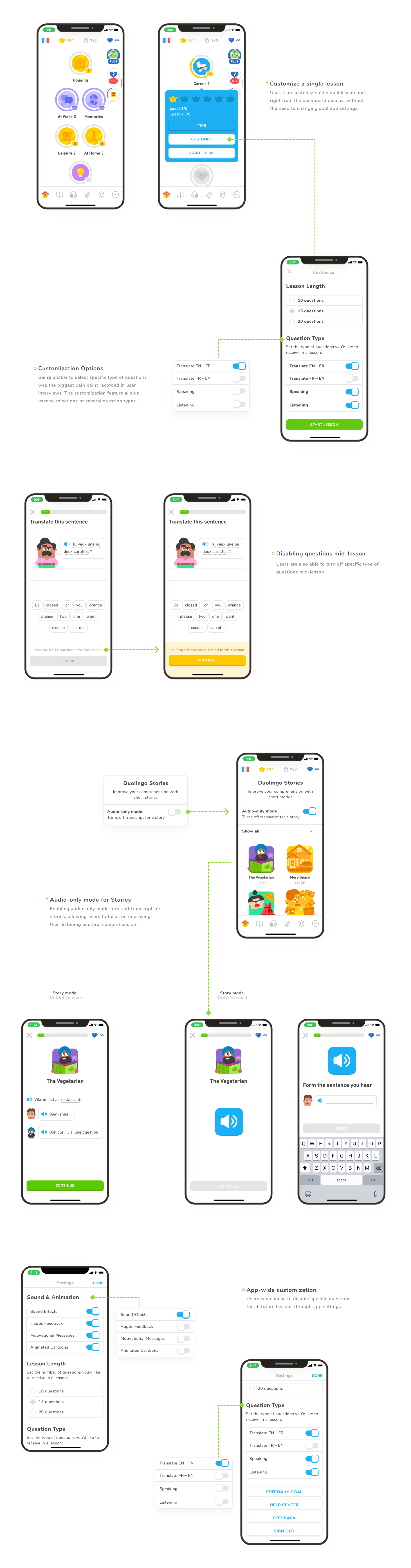
I analysed Duolingo’s current information architecture to find the best location to introduce the lesson customization feature. The current home screen was already quite loaded with features and options, so adding one more button here could potentially overwhelm the user. I found the sweet spot on the lesson type overlay, right before the user can start their selected lesson.

3. User Flows
I then proceeded to narrow down on specific user flows keeping the user personas in mind. The three user flows chosen highlight a few key scenarios that could arise at different points in the app. This also helped me ensure all necessary screens were accounted for before starting the design process.

4. Solution Sketching
Before starting with digital wireframes, I worked on a few solution sketches on all the key screens outlined in the task flow and site map. I explored a few different layouts, while trying to remain as close to Duolingo’s existing workflow and sequence of tasks. After the sketches were sufficiently hashed out, I proceeded to convert them into digital low-fidelity versions.

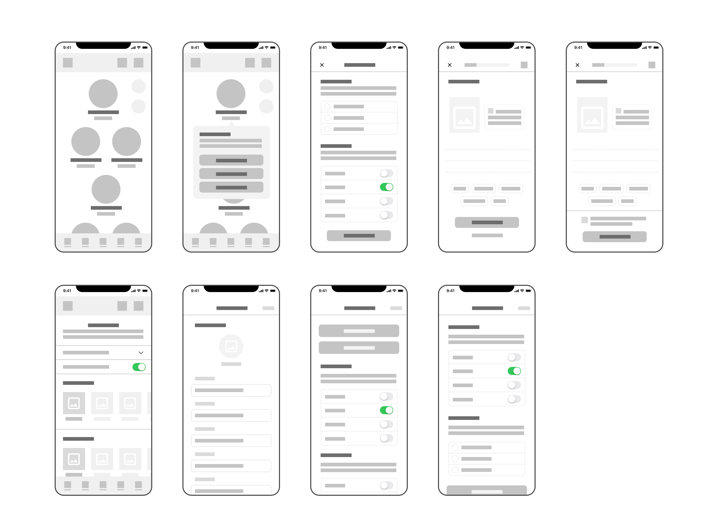
5. Low Fidelity Wireframes
Using the sketches as a base, I focused on creating low-fidelity wireframes that would better convey the structure and ideas behind the proposed screens. I kept the designs minimal and consistent, using this activity to clearly define the elements intended for the screen using gestalt principles.